 **I posted the Mac review, cause we use Macs. But you can check the link below for the full review.**
Mac
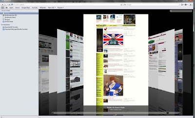
Despite its Windows improvements, the new UI does look much better on OS X overall—the new tabs on top look works really well, I think, though its break with a more standard OS X layout might vastly annoy some people. Also History and Cover Flow look and feel more natural on Mac too.
Another Mac perk: Multitouch zooming, which lets you manipulate the new full-page zoom with iPhone pinch gestures. It's not silky smooth, but definitely slick—it's actually a lot like browsing a page on the iPhone, especially if you're using two-finger scroll to pan and stuff.
Speed difference between Safari 4 and Firefox is a bit more noticeable in OS X. It doesn't kill Firefox, but there's definitely a difference. Cover Flow runs more smoothly, from what I'm seeing, without the jerkiness I got on Windows sometimes, though full history search isn't any quicker—but that's still plenty fast. It does use resources more efficiently in OS X than in Windows: Those same 14 tabs only ate about 230MB of memory.


1 comment:
wow. im debating tryna get that joint...good grief.
oh and another thing. that poll is biased. yall are in ohio. clearly everybody says lebron. kobe is just that much triller though.
AND! the site is now finished. go peep that shit sir.
Post a Comment